
OVERVIEW
Problem
Develop the architecture information and design the interface of a ecommerce magazine shop called Color+Form, that also have to incorporate home decor products.
My role
UI designer /UX researcher
Timeline
March 2018 - June 2018
Solution
We designed a Color+Form ecommerce books & magazines shop of art & design, architecture, travel, lifestyle and fashion subjects. You can also find rare and unique home decor products and daily news about different themes
Typography
Montserrat Semi Bold and Montserrat Light
Team members
Helena Barros, Sofia Campos
Tools
Paper Wireframes, Balsamiq, Sketch, Invision, Photoshop
Our approach
01
Research
Comparative Assessment
Protopersonas and user stories
User interviews
Personas
02
Design
Storyboards
Sketching Lo/fi Prototypes
User feedback
Information Architecture
Interactive Prototypes
03
Evaluate
Usability testing
Design Outcome


RESEARCH
Domain Research
To better understand how to develop the architecture of the information of color+form, we conducted an analysis review and a comparative assessment. For the comparative assessment, we focused on e-commerce websites that to analyze the visual design, usability, and architecture, and explore the strengths and weaknesses features, as well as opportunities.


Our main findings allowed us to understand which features we considered as a strength and opportunities to adopt. Once the research problem was defined and the research design was laid out, our task of data collection begins. Our method of data collection was through a survey with the intention of efficiently gathering from a set of respondents. The survey had mostly closed-ended questions and very few open-ended questions.
Surveys
Our surveys helped us to narrow down our target user group and understand the behavior of users when they do online shopping (if they use the desktop or mobile, or both and in which steps/phase). Through the questionnaire we understood what the target audience value when they buy in a e-commerce shop.

Key Takeaways
Based on our online surveys we learned some unexpected results. Feedback, free shipping, and easy checkout were among the most valued features for our target audience. Also, we understood that our target audiences like to read daily news on the eCommerce website the buy, about themes like fashion, architecture, travel, and lifestyle.

DESIGN
Ideation
Based on the evidence we collected from user research, we conducted an informed brainstorming session. Each member first came up with a variety of ideas individually. Then we share all the ideas and form a number of new ideas.
We also referred back to the main findings in our user research, to make sure that all the themes we identified can address at least one of the main concerns of our users.
We design the architecture of information for Color+Form, and we took into consideration that our persona like to have daily news, and which themes our persona like to read. Eventually, we narrowed our ideas down to the following five large themes that address our users’ concerns from different perspectives (Architecture, lifestyle, art & design, travel, and fashion).


Wireframing
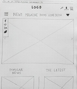
We first quickly sketched some ideas on paper and discussed the main functionalities. We tried to incorporate some features that our persona valued.
We drew out wireframes for crucial screens that represent the essence of our ideas, and then in Balsamiq


User flow
The most challenging was figuring out how to fully develop the flow and architecture of the website/e-commerce shop, and how many menus and submenus.
The overall design concept of this project is based on 3 pillars: minimalism (clean layout), whitespace and strong imagery. A new iconography family, with some details, was also developed for this project.
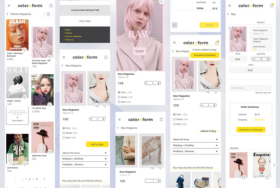
Below you can see the task flow in the desktop experience.
Landing page: We developed from scratch an iconography family


We add an filter so the persona could search by her needs

When the user clicks on add to bag, the CTA button change and a notification shows up to clarify the interaction.

Shipping and feedback were the main features that our persona valued, so we tried to incorporate that into the concept. Also, our personas like to buy books, prints and ebooks, so when we discuss the main functionalities we incorporate that data on the design of the interface.

Creating a cohesive story across an interactive experience was quite the task of this project, especially because was our first experience doing it. The most challenging was figuring out how to fully develop all flow and architecture of the website/e-commerce shop, and how many menus and submenus.
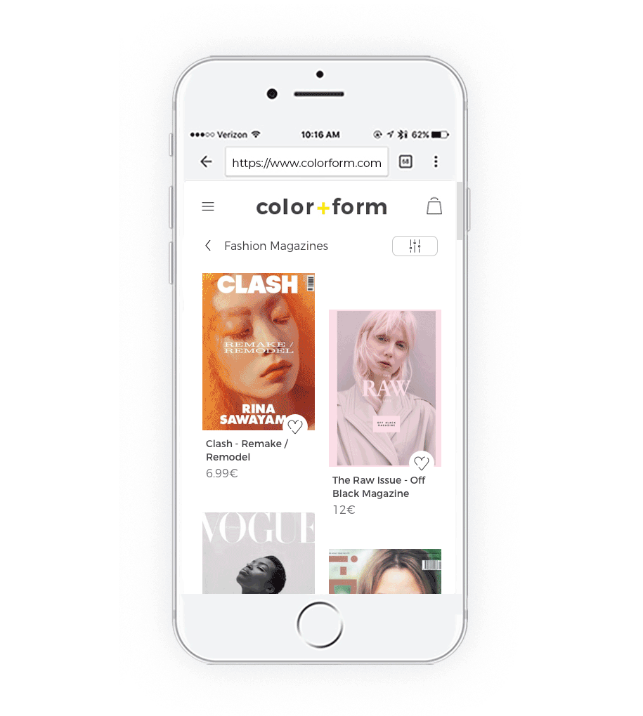
We create an interaction experience for desktop (see bellow) and mobile.
Final Prototype
Reflection
Combining my background in psychology with my passion for technology and design, this project provided an exciting opportunity to merge my interests. However, like any other project, it was not without its constraints.
Constraint 1: Participant demographic
The usability testing participants consisted solely of our network of friends and colleagues. To ensure a more representative user base, a diverse range of participants would have been ideal, providing more accurate insights.
Constraint 2: Time
If I were to continue working on this project, I would conduct a second phase of usability testing to validate the updates made to the original design. While the changes were minor, obtaining concrete data showcasing improvements in task completion time and success rates would be valuable.
This project allowed me to combine research and design, reaffirming my passion for the field. As a designer, I strive to be well-rounded and welcome any chance to apply user research methods to my work.